

Brand kit v1.0
Logos, colors, type.
Shopos runs ads, content, email, and store ops through four agents. This is the reference for everything that carries the name. Take what you need.
Logo
02 lockups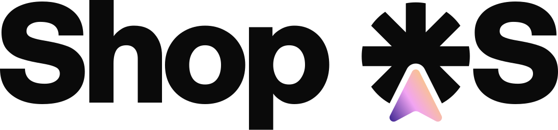


- Clear space equals the height of the S.
- Below 32px the icon runs alone.
- Point it up. The mark has one orientation.
The asterisk
The markShop ✱ S
It marks the O in OS.
Shopos is an operating system for the brands coming next. The asterisk is where that claim sits in the name.
- Efficiency
- Four agents cover what used to take a full team and a retainer.
- Turnover
- Old brands run on process. This runs on output, and the gap compounds.
- New playbook
- Founders starting today get the system on day one instead of building it.
Agent colors
04 colorsEvery agent owns a color. Use it for avatars, callouts, and anything tagged to that agent's work. Click a card to copy the hex.
Signature gradient
03 stopsThree stops, one shape. The beam lives inside the mark. Keep it there and off type, buttons, and backgrounds.
Palette
04 colorsCore
Typography
03 roles- SF Pro Display, display and headingsApple's system face, requested through the platform stack rather than hosted. Weights 500 and 700. Use it for headlines and section heads only.
- Manrope, body and UIParagraphs, labels, interface text. Set 15 to 16px at 1.6 line height.
- SF Mono, specs and dataHex values, labels, timestamps. Anything a reader scans as a number.
If Shopos were a person
03 traitsThree traits. Run copy, decks, and customer replies through them before anything ships.
- Honest
- Says the bad number in line one. No spin on a flat quarter.
- Dry humor
- Flat delivery, always. If a campaign is mid, it says mid.
- Intense
- Founder speed. Ship, measure, ship again.
Shopos brand kitUpdated August 2026