

 ChatGPT
 Perplexity
 Claude
 Gemini
 Grok
Grok
Key takeaways
- Ad traffic is expensive, so a Black Friday landing page must finish the job. Google rates landing page experience by how relevant and useful the page is to people who click an ad (Google Ads Help).
- Phones carry the weight, and slow pages lose real money. Adobe put mobile at 57.5% of Cyber Monday’s 2025 online sales (Adobe).
- A price mismatch can get your products disapproved in Google, which is scary, so the ad, the page, and the feed must agree (Google Merchant Center Help).
- Hidden costs scare buyers away. Baymard found extra costs were a top reason for abandoned carts, cited by 40% of shoppers (Baymard).
A shopper taps a bright ad: “Hoodies, 30% off, ends tonight.” The page loads slowly. The price shows $64, not the $49 in the ad. Then it asks her to create an account. She sighs, annoyed, closes the tab, and forgets the brand by dinner.
The brand paid for that click and still lost the sale. A Black Friday landing page prevents that quiet, painful leak. This guide shows how to build one that keeps the ad’s promise, loads fast on a phone, and earns trust.
What is a Black Friday landing page?
A Black Friday landing page is a simple, focused page built for one sale and one audience. It repeats the ad’s promise, shows the offer and its real deadline, and makes buying simple. Unlike a normal collection page, it exists to finish the job the ad started.
Most pages that rank for this phrase are templates or galleries of pretty examples. Pretty isn’t the point. A page that wins looks calm, loads fast, and says exactly what the ad said. That’s the whole secret.
Google’s own language is useful here. It describes landing page experience as how relevant and useful your page is to people who click your ad (Google Ads Help). Relevant and useful is a good test for every element you add.
What is message match? Message match means the ad and the page say the same thing: same offer, same price, same picture, same words. When they match, shoppers feel safe. When they differ, they feel tricked.
Do you need a separate Black Friday landing page?
Often, no. A clean collection page can do the job when your offer is simple, like “all hoodies 25% off.” Simple is smart. Build a dedicated Black Friday landing page when your ads promise something specific, such as a bundle, early access, or a limited drop that a normal page can’t explain.
Use this quick test. If one sentence explains the offer and your collection page already shows it, keep the collection page. If the offer needs a story, rules, or a deadline, build the dedicated page. Simple wins here.
A dedicated page is also easier to measure. All paid traffic lands in one place, so you can see orders, drop-off, and speed without noise, and clean data is a relief. The wider Black Friday marketing strategy plan explains how to size offers before you build.
Fear of missing out pushes teams to build ten pages, and that wastes precious energy. Be honest about your capacity, too. A simple page that ships on time beats a gorgeous page that arrives after the sale starts. Tired teams make costly mistakes in the last week.
What should a Black Friday landing page include?
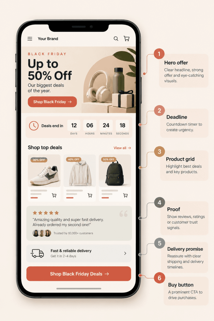
A strong Black Friday landing page has six parts: a clear offer headline, the real deadline, the products, honest proof, a short delivery promise, and one button. Put the offer and the deadline above the fold. Everything else should support one decision: buying today.
Here’s a simple wire-frame, top to bottom:
- Hero. The offer in plain words, the real end time, and one strong product image.
- Offer rules. Discount, minimum spend, and what’s excluded, in two short, honest lines.
- Product grid. Your best sellers first, each with the sale price and the old price.
- Proof. Real reviews or ratings near the buy button, not hidden at the bottom.
- Delivery and returns. A short, clear promise about shipping dates and returns.
- Button. One strong call to action, repeated after the grid, never hidden.
Show the full price early. Baymard found that 40% of US shoppers abandoned a cart because extra costs were too high, and 19% didn’t trust the site with their card details (Baymard). Surprise fees feel like a betrayal.
Leave out anything that doesn’t help someone buy. Skip the heavy slider, the long brand story, and the five competing offers. A calm page converts better than a noisy one, and it loads faster too. A calm layout also feels trustworthy at a glance.
How do you match a Black Friday landing page to your ads?
Match your Black Friday landing page and your ads in four places: the offer, the price, the picture, and the words. If the ad says 30% off hoodies, the headline says it too, with the same photo and the same final price. Any gap makes shoppers doubt you, and your spend quietly leaks away.
Walk through each ad with a fresh pair of eyes. Click it on a phone, then read the first screen. Ask one question: would a stranger believe this is the same offer? If the answer feels shaky, fix the page before you waste more money.
Price consistency is the sneaky one. Google compares the price in your product data with the price on your page, and a mismatch may lead to painful disapproval and even account suspension (Google Merchant Center Help). It’s scary on the busiest weekend of the year, and the fear is justified.
Timing matters too. Shopify’s help center says product changes usually show up in Google after a few hours (Shopify Help Center). So change prices the night before, not at midnight on launch, or the ad and the page will disagree for hours. Late, rushed edits are the enemy, and they cause painful, avoidable mismatches.
If you run catalog ads, the feed is the other half of this match. The guide to Meta catalog ads shows how the feed and the page fit together, and a messy feed will hurt.
How fast should a Black Friday landing page load?
Your Black Friday landing page should hit the “good” range in Google’s Core Web Vitals: main content in 2.5 seconds or less, interactions in 200 milliseconds or less, and almost no layout jumping. Phones matter most, because 57.5% of Cyber Monday online sales came from mobile in 2025. Slow pages lose real money.
Google measures these at the 75th percentile, split by mobile and desktop (web.dev). The targets are a Largest Contentful Paint of 2.5 seconds, an Interaction to Next Paint of 200 milliseconds, and a Cumulative Layout Shift of 0.1. Check your mobile numbers first, because that’s where pages usually fail. Slow pages feel painful, and shoppers hate waiting.
Adobe found that mobile shoppers drove $8.2 billion of Cyber Monday spend (Adobe). Those buyers use one thumb, a weak signal, and thin patience. Test your page on a real phone, not just a desktop browser.
Every extra widget adds weight. Chat bubbles, spin wheels, pop-ups, and countdown scripts all fight for the same slow connection. Keep only the ones you can prove help, and load the rest after the main content. Fast beats fancy every time.
Which urgency tactics are honest on a Black Friday landing page?
Honest urgency uses real limits: a true end time, real stock counts, or a genuine early-access window. Fake timers that reset, invented “only 3 left” banners, and made-up viewer counts destroy trust fast. Shoppers forgive a short sale. They rarely forgive feeling tricked.
Real tools work well, and they feel honest. Show a countdown to a fixed time that never resets. Show stock only when it comes from live inventory, never from a guess. Offer early access to your email list, and say exactly when it ends.
Trust is fragile at checkout. Baymard found that 19% of shoppers abandoned a cart because they didn’t trust the site with their credit card information (Baymard). One fake banner can raise that doubt.
There’s a bonus to honesty. When your numbers are real, you can reuse the same page next year without embarrassment. Picture a shopper who refreshes and sees a timer reset to ten minutes. She feels tricked, loses trust, and tells her friends.
How do you test and improve a Black Friday landing page?
Change one thing at a time on your Black Friday landing page, and judge each test on real orders, not easy clicks. Start with the headline, then the hero image, then the button. Give every test enough traffic to be fair, and stop testing about two weeks out, so panic never drives the peak.
Darkroom suggests freezing new ad concepts about two weeks before the sale, which is November 13 this year (Darkroom). Apply the same discipline to the page. Late changes cause bugs, and bugs hurt most when traffic is highest. A calm freeze protects everyone from panic.
Keep a simple log: what you changed, why, and what happened. That log is gold next year. For a fair testing method, follow the ad creative testing guide.
After the sale, don’t delete the page. Keep the address live and switch it to an early-access sign-up for next year. You keep the history, and you collect eager shoppers for free.
What mistakes ruin a Black Friday landing page?
Five quiet mistakes ruin most Black Friday landing pages: a slow hero image, a price that conflicts with the ad, a hidden shipping fee, a fake timer, and a button that’s hard to find. Each one feels small. Together they quietly burn your ad budget and your customers’ trust.
- The slow hero. A huge image makes the first screen crawl, and impatient shoppers leave.
- The price gap. The ad says $49, the page says $64, and trust dies on the spot.
- The hidden fee. A shipping surprise at checkout feels like a trap.
- The fake timer. It resets at midnight, and shoppers notice.
- The lost button. If buyers must hunt for it, many simply give up.
Every one of these is easy to fix before launch and painful to fix during the peak. The Black Friday checklist gives you a calm, step-by-step way to catch them early.
How can a small team ship a Black Friday landing page fast?
Use a short, repeatable build: write the offer, pull the products, check the price rules, and publish from a tested, safe template. ShopOS is a technical product that scales this work, so a small team can ship many page versions fast, without a painful wait for a developer.
Richard, the Shopify store manager agent, ships the store updates that usually wait for a developer. Monica, the creative agent, makes hero images and product visuals. Brand Memory keeps every version sounding like you, and nothing goes live without your approval, so nothing risky slips out. That means fewer late nights and fewer mistakes.

Here’s the honest limit. If you run one simple offer, a good theme section and one focused afternoon will do. ShopOS pays off when you need many page versions, many images, or fast changes across a big catalog. Software should feel like relief, not another chore.
Want to see how it handles your pages and creative? The free tier gives you 500 credits to explore safely. Building for a large catalog? Book a call: Book a call.
FAQ
What should a Black Friday landing page include?
Include a clear offer headline, the real deadline, your best products with sale prices, honest proof such as reviews, a short delivery and returns promise, and one main button. Put the offer and deadline above the fold, show total costs early, and cut anything that doesn’t help someone buy.
How much does a landing page cost?
There’s no single price. Many store platforms and page builders let you publish pages inside a plan you already pay for, while agencies charge per project. The bigger, costly part is the ad traffic you send, so don’t gamble on a fancy build. Start simple, test small, and spend more only after the page proves itself.
Can ChatGPT build a landing page?
Yes, it can draft headlines, copy, and basic layout code. But it can’t know your real prices, stock, or deadlines, and it can invent claims. Check every number by hand, be careful with claims, test speed on a real phone, and make sure the page matches your ads before you spend a cent.
Can I get a free landing page?
Yes. Many builders offer free plans or trials, and most store platforms let you add pages at no extra cost. Check the limits before you send paid traffic, especially custom domains, tracking, and speed. A free page that loads slowly is expensive once you pay for clicks.
What is a good conversion rate for a Black Friday landing page?
No trustworthy public benchmark exists, so doubt anyone who quotes one. Your own November 2025 numbers are the most honest guide. Compare the same offer type, the same traffic source, and the same device, then aim to beat that baseline with small, careful tests.
How long should a Black Friday landing page stay live?
Keep it live all year. After the sale, switch the page to an early-access sign-up for next year, so the address keeps its history and your eager shoppers can join a list. Deleting the page throws away traffic and trust you worked hard to earn.